Housing Matters
Redesigning a charity website for accessibility and crisis support.
The problem
The original site suffered from poor UI design and a lack of optimised user journeys tailored to its core audiences. Clients in crisis faced unnecessary friction when trying to access support, the donation process lacked prominence, and there was no clear delineation between the journeys of different audience types.
The approach
I started with research rather than pixels, building user personas from analytics and interviews, then journey-mapping each audience segment to surface friction points and information gaps.
- User personas developed from analytics and user research
- Journey mapping for each audience to identify friction points and information gaps
- Competitor analysis of comparable charity websites
- A full accessibility review against the needs of vulnerable users
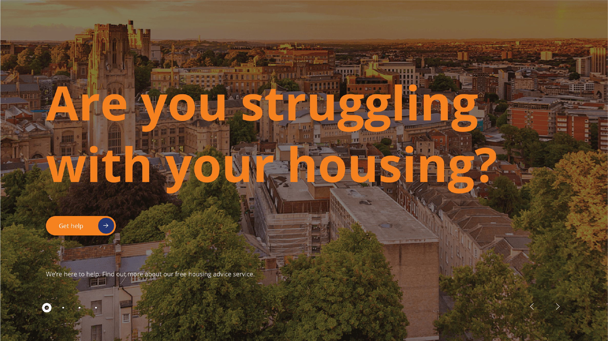
The solution
A comprehensive redesign built around distinct user journeys crafted for each audience type. For clients, that meant prioritising an immediately accessible "Get Help" pathway with clear signposting. For funders, partners and donors, the site communicated impact more effectively and introduced a prominent, frictionless donation flow.
The whole experience was optimised for SEO and rebuilt to be fully mobile responsive, so support is reachable wherever someone happens to be.
When someone arrives in crisis, every extra tap is a barrier. The redesign's job was to remove them.