The Jam Jar
Redesigning a local Bristol music venue's website, balancing raw energy with real accessibility.
The problem
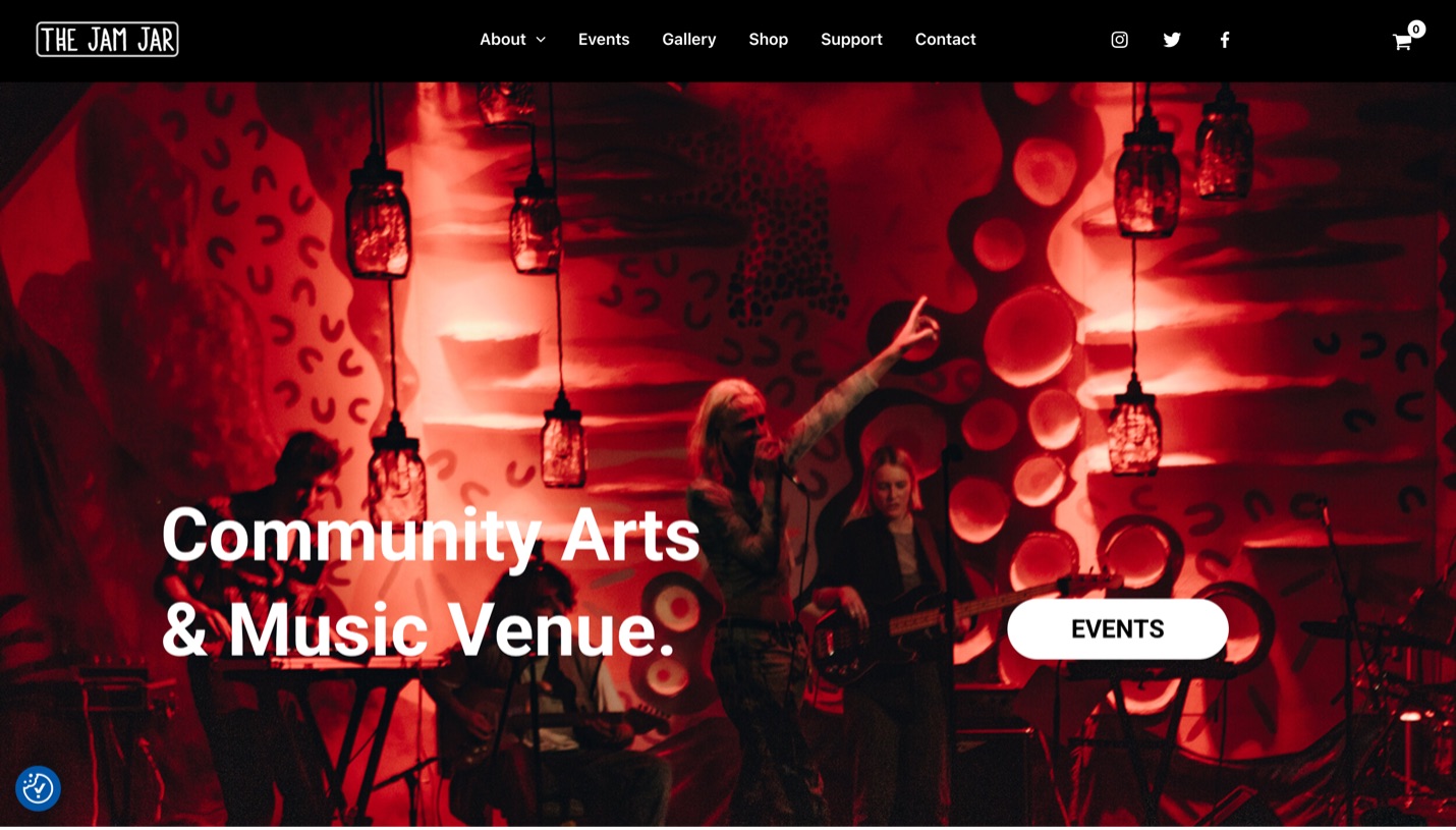
The Jam Jar is a grassroots music venue and community space in Bristol. For a university brief I redesigned its website around four jobs it has to do at once: help people discover and book events, sell merchandise, rally community support, and do all of it while being genuinely accessible.
The real challenge was tone. A grassroots venue should feel bold and a bit raw online, the way it does in person, while staying usable for everyone who wants to come through the door. Local character and real accessibility had to live in the same design, not pull against each other.
Research & insights
Before wireframing, I looked at how comparable Bristol venues and local businesses present themselves online, studying The Clock Factory and Document in particular. The aim was to learn from sites speaking to a similar audience rather than design on personal taste alone.
That comparison shaped three decisions:
- Navigation: keep the top-level structure short and predictable, so events, shop and support are never more than a tap away.
- Content organisation: lead each page with the one thing a visitor came for, then layer detail beneath it.
- Visual presentation: let photography carry the venue's atmosphere while the interface stays quiet around it.
To keep the layouts coherent I leaned on Gestalt principles throughout:
- Proximity: grouping related items so their relationships read at a glance.
- Similarity: styling like elements alike to establish repeatable patterns.
- Continuity: guiding the eye through each page in a deliberate flow.
- Closure: using implied shape and boundary to tie sections into whole units.
Design decisions
The palette starts from accessibility. A black and white base gives strong, dependable contrast, then red and green accents appear sparingly to flag the things that matter, an event to book or a button to press, without shouting over the content.
- #111111Primary
- #FFFFFFBase
- #E2362BAccent
- #1C5B4FAccent
Type is set in Roboto, picked for clean readability across screen sizes. Staying with one family and using its weights for hierarchy kept the pages cohesive without introducing competing typefaces.
The layout follows patterns people already know: a clear header and navigation, focused content sections, and an informative footer. Familiar structure lowers the effort of finding anything. I wireframed web-first in Figma, then adapted each screen down to mobile so the two experiences stayed consistent.
Accessibility, by design
The brief asked for real accessibility, not a checkbox, so I gave it a dedicated page rather than burying the details, offered the same information as a downloadable PDF, and carried the high-contrast palette through the whole site.
What that page sets out plainly:
- The venue sits on the first floor: the main entrance has 19 steps with a handrail and a passing point, and a wider secondary entrance can be opened with staff assistance on request.
- There is no accessible toilet on site; the nearest is in Cabot Circus, roughly 200m away, and a private staff toilet can be made available.
- Personal assistants get free tickets, arranged ahead of the event or on the door.
- Strobe lighting is generally avoided, and guests prone to seizures can ask staff to confirm before an event.
- Assistance dogs are welcome.
Surfacing this up front is a design decision in itself: it tells disabled visitors what to expect before they arrive, which is exactly where trust starts.
The build
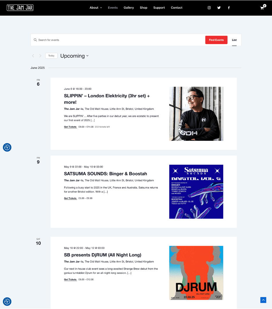
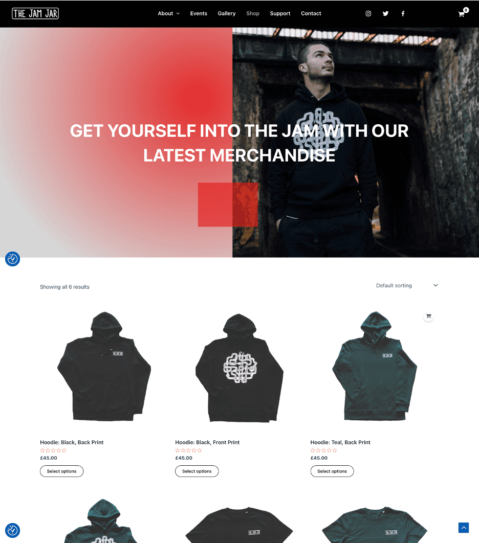
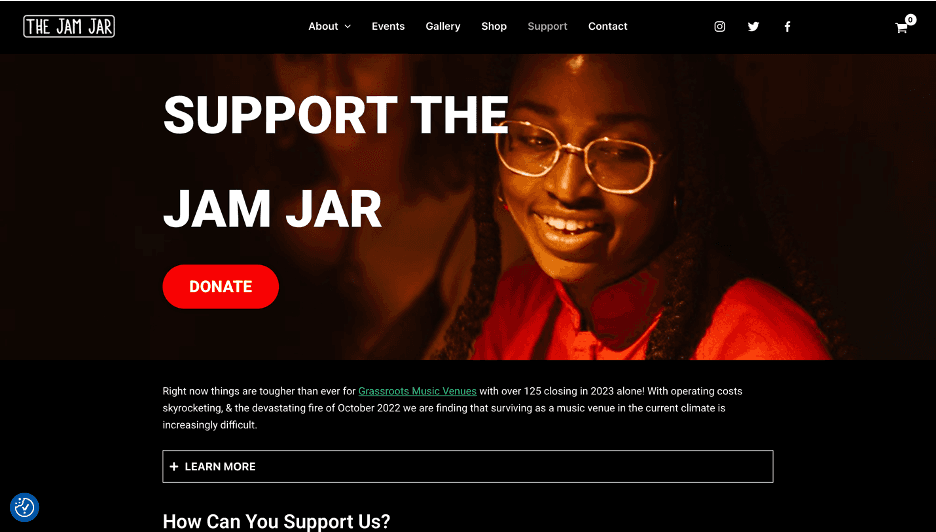
I built five bespoke pages (home, events, shop, support, and a combined about and accessibility page) in WordPress. WooCommerce powers the shop with custom styling, and The Events Calendar adds integrated listings and ticketing. Both plugins were customised so they read as part of one brand rather than bolted-on tools. Performance was tuned with image compression and lazy loading.
A grassroots venue should feel like one online, bold and a bit raw, without ever locking out the people it serves.
Outcome & reflection
One brand across third-party tools
WooCommerce and The Events Calendar were customised to disappear into a single, consistent identity through the browse, book and buy flows.
Everything under one roof
Event discovery, ticketing, merchandise, community support and accessibility all live in one CMS the venue can maintain itself.
Accessibility as a first-class page
A high-contrast design and a dedicated, downloadable accessibility page put inclusion in plain sight rather than the small print.
What I'd do differently
- Run structured user testing earlier and with a more diverse group, rather than leaning mainly on peer feedback during the build. It would have surfaced usability issues while they were still cheap to fix.
The live site is no longer hosted (the university hosting expired), but the full Figma wireframes remain as a record of the design.
View the wireframes →