BarHub
An app connecting people with local pubs through personalised recommendations and pub crawl planning.
The problem
Local pubs and bars face intense pressure from larger national chains with greater marketing budgets and brand recognition. Smaller establishments struggle to reach new customers, often relying on word-of-mouth while potential visitors default to familiar or well-advertised venues.
For people going out, discovery was just as broken: it was frustratingly fragmented, relying on generic tools like Google Maps that lack any niche focus, personalised recommendations, or the social, planning dimension central to going out in groups.
Research & insights
I ran a mixed-methods research phase: an online survey of 30 potential users, three personas with mapped journeys, and a competitive SWOT. The survey was clear about what actually drives a choice of venue: atmosphere and pricing come first, ahead of distance or brand. People wanted to find places that fit a mood, then plan a night around them.
To find the gap in the market, I ran a SWOT on the two tools people were already using:
Strengths
- Vast location database
- Trusted user reviews
- Deep integration with other Google services
Weaknesses
- No pub or nightlife niche
- No personalisation
- Nothing for planning a night across venues
Strengths
- Clear pub & nightlife focus
- Curated listings and ratings
- Social sharing built in
Weaknesses
- Thin user base
- Inconsistent data quality
- Weak search and filtering
The wedge: combine the strengths of both (map-first discovery, a genuine niche focus, personalised recommendations and crawl planning) while fixing the weaknesses neither had solved.
Personas
Three personas kept the work honest, each a different reason to open the app.
Design process
I worked from structure outwards. A priority guide ranked what mattered most, a critical flow chart mapped the journeys, and wireframes turned both into layouts, all before any visual design.
- 01Map / LocatorFind pubs on a map around you
- 02Pub details & infoAccessibility, facilities and details for each pub
- 03Pub crawl plannerOrganise pubs in order and plan a route
- 04News & offersVenues share offers and promote themselves
- 05FavouritesSave the pubs you love
- 06SearchLook up specific locations
- 07ShareSend pub locations and crawls to friends
Map
- Search for a pub
- View a location
- Details, reviews, directions
Planner
- Create a crawl
- Add venues or auto-generate
- Upcoming & past crawls
News
- Latest offers
- Nearby venues
From there I built a high-fidelity, interactive prototype in Figma, using iOS templates and SF Symbols for a native feel. Then I designed a brand to match.
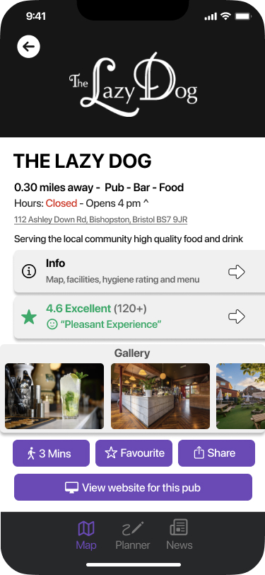
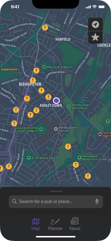
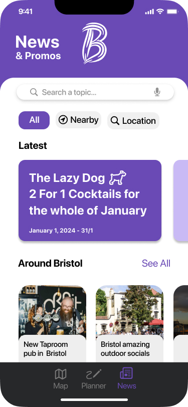
The wireframes became a high-fidelity prototype: rich venue profiles, a map-first home, and a news and offers feed.
One small change came straight from user feedback. The app was originally called “Boozer”; testers felt the word was dated and off-putting, so it became “BarHub”, a central hub for discovering local pubs and bars. Minor on its own, but a clear sign of letting users steer the design.
- #694AB5 Primary
- #D9D9D9 Neutral
- #000000 Ink
- #FFFFFF Base
The build
Most UX projects stop at a prototype. I took BarHub all the way to a fully functional iOS app, rebuilding the Figma designs in Xcode and SwiftUI.
The real engineering challenge was the map. Rendering live pub markers meant learning MapKit, using MKLocalSearch to query for pubs around the user’s location and drop them onto the map.
func searchPubs() {
    let request = MKLocalSearch.Request()
    request.naturalLanguageQuery = "pubs"
    request.region = MKCoordinateRegion(
        center: CLLocationCoordinate2D(latitude: 51.481230,
                                       longitude: -2.580748),
        latitudinalMeters: 5000,
        longitudinalMeters: 5000)
}
Coming to Xcode and SwiftUI as a new iOS developer meant a steep learning curve. I closed the gap with self-directed learning and an agile build-test-refine loop, shipping the app in small working iterations rather than all at once.
I also made a deliberate cut: no login screen. Going out is spontaneous, so forcing an account would only add friction. Skipping it keeps the experience instant while protecting user privacy. You open the app and you’re straight on the map.
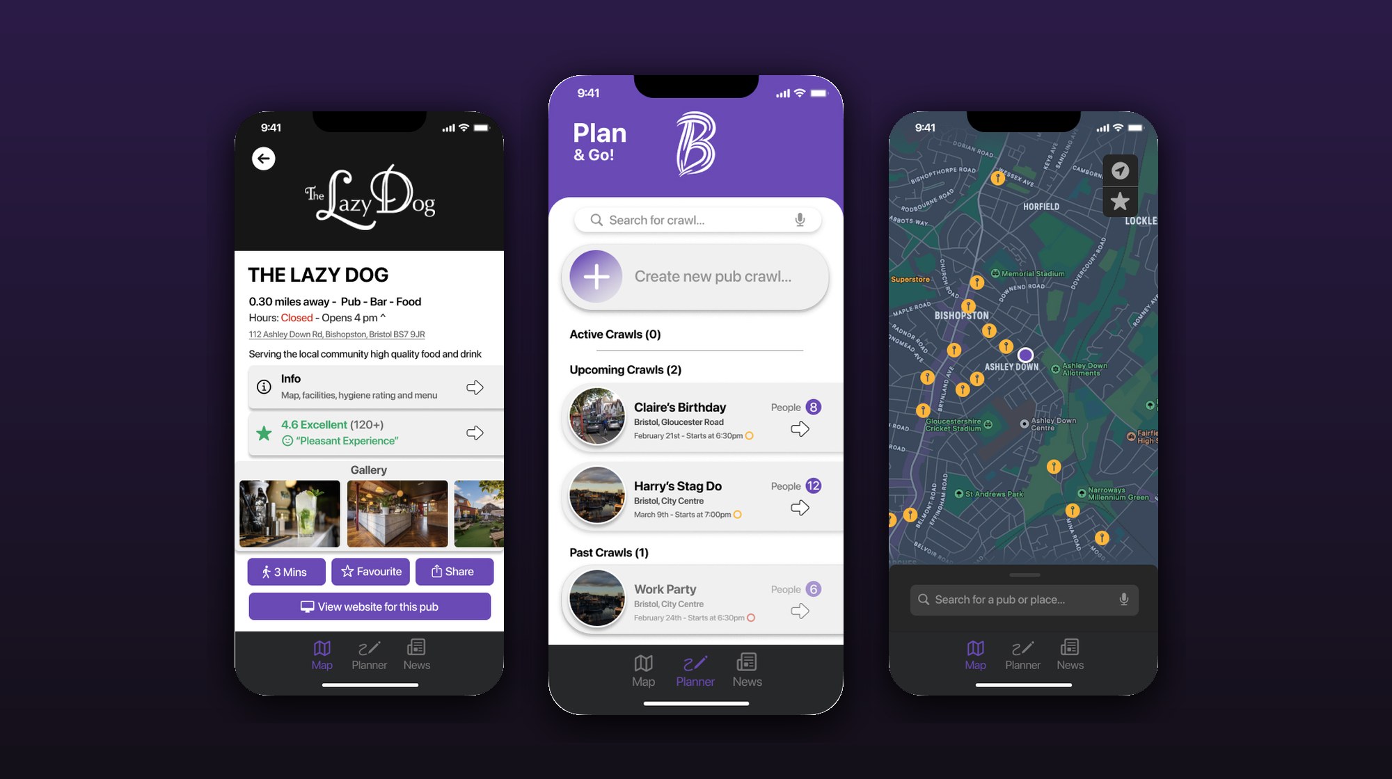
The pub crawl planner is BarHub’s signature feature. Per the research, no existing app offered anything like it. You name a crawl, add venues in order or auto-generate a route, and the app plots the path between stops so a group can move through the night without breaking stride.
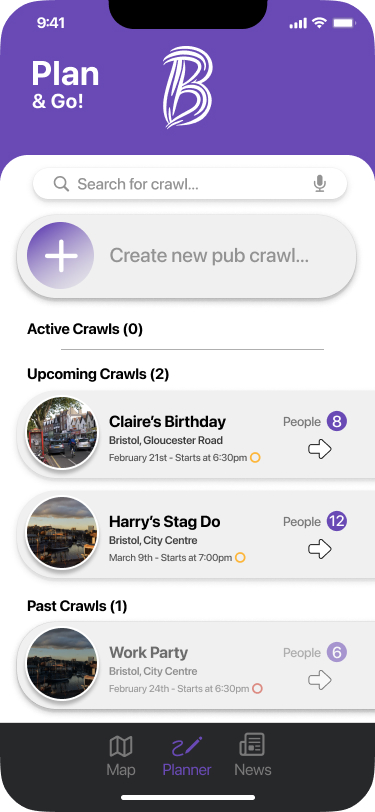
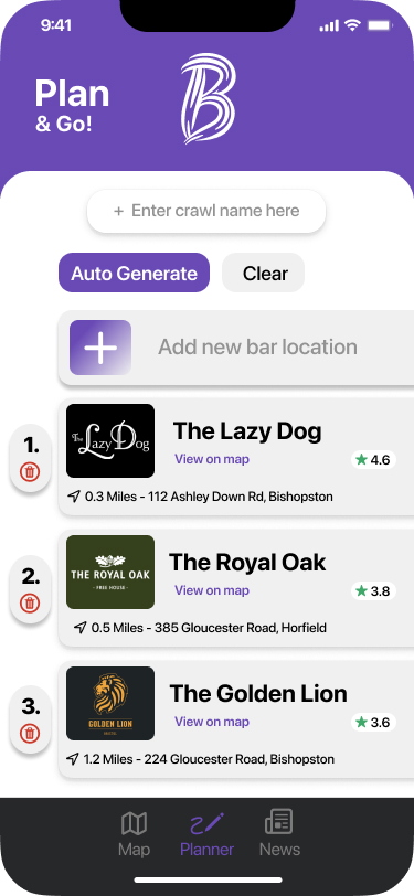
The pub crawl planner: name a crawl, add venues in order or auto-generate a route between them.
Testing & iteration
I ran small, focused user-testing sessions throughout the build, with a handful of target-demographic users doing real tasks: find a venue, view a review, plan a crawl. Quick to run, and rich in detail.
The most important finding came early: the initial navigation confused people and stopped them completing tasks. They couldn’t reliably move from discovery, to detail, to planning.
So I redesigned the navigation, streamlining the flows down to the three-tab Map / Planner / News structure from the flow chart and clearing the paths between them. Task completion improved in the next round of testing.
Test, learn, fix, then test again. The navigation only worked because users told me the first version didn’t.
Outcomes & reflection
Navigation redesigned from user testing
The biggest usability gain came straight from watching real users struggle, then fixing what tripped them up.
No-login, map-first by design
Cutting the sign-up wall made discovery instant and kept user data out of the picture.
Prototype → functional SwiftUI build
Shipping a working iOS app, not just a clickable mockup, is rare for a UX portfolio, and it proved the design held up in real code.
A pub crawl planner no one else had
The research found no competitor offered crawl planning; it became BarHub’s clearest point of difference.
What I’d do differently
- Test continuously, not just at key stages. A more systematic loop would have caught usability issues earlier, when they’re cheaper to fix.
- Ramp up on Xcode and SwiftUI sooner. An earlier start on the iOS toolchain would have eased the pressure on the build phase.