Housing Matters
Redesigning a charity website for accessibility and crisis support.
The problem
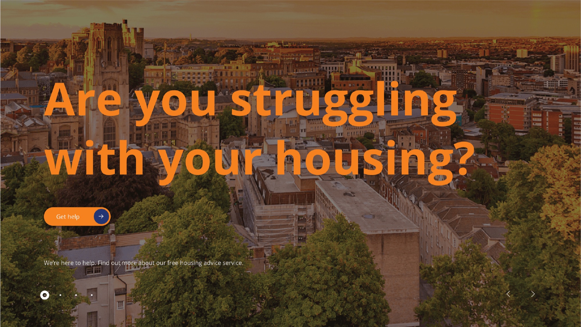
Housing Matters had one website trying to serve four very different audiences: clients in crisis, funders, partners, and individual donors. Their needs barely overlap, yet the site gave them no separate paths. Someone arriving in crisis hit friction before they could reach support, and the donation route lacked prominence.
The old design also looked dated and was hard to use on a phone, which is exactly where many clients would land.
My role and the team
This was a Design Enterprise Studio team project for a real client, so I want to be clear about what I owned. I contributed to the user research, the UX/UI design, and the WordPress build alongside the team. The SEO workstream was delegated to me alone, so that piece is mine end to end.
- User research and persona development, with the team
- UX/UI design across the four audience journeys, with the team
- WordPress and Elementor implementation, with the team
- SEO, owned solo: keyword research, on-page optimisation, and image optimisation
Research and insights
We started with research rather than pixels. Using the client's own analytics plus our user research, we built personas that captured the demographics, behaviours, motivations, and pain points of each audience. Then we journey-mapped every audience to surface the friction points and information gaps. That mapping drove real decisions, like combining overlapping pages so people were not sent in circles.
We also reviewed comparable charity websites to see what helped users and what got in their way:
On the strongest sites
- A prominent crisis or help call to action
- Plain, jargon-free language
- A clear, visible donation path
- Impact told through real stories and stats
On the weaker sites
- Help buried deep in the menus
- Dense, institutional copy
- Donation hidden in the footer
- Layouts that broke on mobile
Designing for four audiences
The core decision was to give each audience its own path through the site instead of one route for everyone.
Accessibility and crisis-first design
If the site failed the person arriving in distress, nothing else mattered. Accessibility was a design driver here, not a final checklist.
- Put the "Get Help" route first, so someone in crisis reaches support in the fewest possible taps.
- Plain, clear language throughout, for users under stress or with a language barrier.
- An on-site translation option for people who do not read English as a first language.
- Colour contrast and legible type, checked against the brand palette.
- Full mobile responsiveness, because many clients arrive on a phone.
When someone arrives in crisis, every extra tap is a barrier. The redesign's job was to remove them.
The build and SEO
Most UX projects stop at a Figma file. This one shipped. We implemented the designs in WordPress with Elementor and took the site live for the charity.
View the live site ↗The live site has continued to evolve since our 2024 handover.
SEO was mine to own
This was my individual deliverable from start to finish. I ran keyword research, then handled on-page optimisation across the site, and tuned images for performance. The goal was simple: make sure clients, funders, and supporters could actually find the charity.
- Keyword research to target what each audience was searching for
- On-page optimisation: titles, meta descriptions, headings, and content structure
- Image optimisation for faster loads and better discoverability
Outcomes and reflection
Shipped live for a real charity
The redesign went into production in WordPress, not just a clickable prototype.
Four audiences, four clear journeys
Clients, funders, partners, and donors each got a path built around their actual goal.
Crisis support made prominent
The "Get Help" route was pulled to the front and stripped of friction.
An SEO and mobile foundation
On-page SEO and full mobile responsiveness made the site easier to find and to use on any device.
What I learned
Our biggest challenge was stakeholder communication. Not everyone in the client organisation was kept aligned as the work progressed, which surfaced during a presentation and meant revisiting decisions we thought were settled. If I ran it again, I would agree communication protocols and a single point of contact at kickoff, so feedback stays consistent and nothing gets reworked late.